There is one element that glues together all digital marketing strategies.
Of course, it’s your web site.
Web site represents the core content distribution media for users and their initial contact with your brand and company.
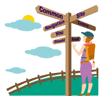
Have you ever wondered what elements each web site navigation should have? Everyone is always talking about a web design, whose task is to put all elements well and functionally into a single entity to make the site better, more visible, more functional and easy to use.
Barely anyone really talks about this site navigation. Site navigation is perhaps the most critical (and possibly most overlooked ) element of the website that has a direct effect on your CTA.
If your navigation is not good or confusing the user, then it is very likely that you will leave the site very quickly.
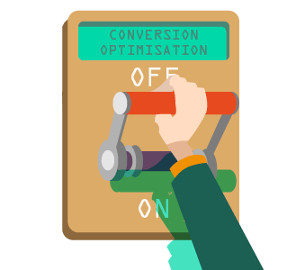
When it comes to SEO optimisation, and in terms of positive user experience, website navigation is a crucial factor that directly affects the success of your website.
Everything about the site is linked to the website’s navigation. And this makes the website navigation all the more critical.
After all, navigation is often the critical obstacle between the user and his goal (whether they are buying products, finding valuable information, subscribing to newsletters, etc.).
If a website’s structure allows someone to click through it intuitively and fast, while finding what it is that they are looking for, then it is much more likely that they will become a regular user or visitor of what the website is offering.
Well, to make this barrier smaller, navigation should be structured in a way that makes sense to online users.
Sounds pretty simple right? Not quite.
In this article, we will highlight the most common traps and bugs in the navigation of your website, and how to resolve them. Most of these are easily fixed once you recognise them.
How to structure your site navigation?
Website navigation is like a map for your users that guide them to different areas on your website. Without the proper navigation website, users will feel like they are lost in the jungle without a map.
And you wouldn’t go camping without a good map, would you? That’s why your site navigation should be like a detailed and reliable map.
Site navigation is the primary thing to consider when building a website. You are making your site for a reason and with a goal. It would be best if you thought about that when you structure your site’s navigation.
In fact, your navigation also depends on what you want to achieve, what your goals are, what you are doing and what your target audience is.
In most cases, the position of the primary menu and the order of information on the page depends on their importance and how they will be used.
Again, it all comes down the users.
Some of the questions you need to ask: Is your target audience a younger generation or a little older? How do they behave? What is your aim for them, to purchase a product or subscribe to a newsletter form?
Website navigation is also essential for your search engine rank.
A useful and proper navigation system makes it easy for the search crawls to go through your website and index your pages.
Also, don’t forget – improved search ranking increases organic traffic to the site, and this could lead to more conversions.
Without the right navigation, even the best design won’t meet their goals. Despite this, many developers often ignore its importance.
Now, let’s take a closer look at the most common pitfalls in site navigation.
7 Common Pitfalls in Site Navigation
1. Complicated Primary Navigation
The human brain can understand only a few things at once, so it is best that primary navigation has as little content as possible – best is from 3 to 7.
If you overwhelm the primary navigation with too much content, you will only confuse the user who will feel like in the labyrinth. Moreover, after this unpleasant experience, they will not return.
When you have a lot of content or products, and especially when your site has evolved over time, it is not hard to get lost with your primary navigation.
If too much stuff is going on in your menu, it makes it hard for visitors to find the information they are searching for.
It’s crucial that you keep in mind what are your goals and “tasks” you want from your visitors to perform.
Everything else that is taking attention and navigation away from this information is seen as complex. With adding fewer menu items, your visitors will pay attention to all the other parts.
Short navigation is also valuable for SEO because when your navigation has too many links, less authority and trust is passed down to the interior pages.
The more concise your navigation is, the more home page authority will flow to the internal pages, making them more likely to rank.
2. Drop Down Menus
Drop down menus are generally bad, but these two reasons why are pretty obvious:
- Drop-down menus are difficult for search engines to crawl on
- drop-down menus are annoying
Drop down menu encourages visitors to skip important pages, and it gives your visitors a headache. Why? We move our eyes faster than we move the mouse.
By the time we move the mouse to a menu item, we already made up our mind about clicking on it – and then the drop-down menu comes. It bombards us with more options, and that can be annoying.
Also, drop-down menus make it difficult for search engine robots to crawl through your website, which means your search ranking will be lower.
This also means that visitors overlook some of the most important pages of your website. Since the reaction time of drop-down menu is prolonged, it is best to leave out drop-down menus in your site navigation.
3. Nonstandard navigational style
With this, we don’t mean that you need to kill your creativity. Use your creativity of general design and looks of the website but follow the order.
However, website navigation is not a place where you should try out new ideas. With website navigation, you need to be conventional and give users what they anticipate. The complex system of icons, buttons and weird site areas are a terrible idea for your site user experience and usability.
Your web page users are used to seeing the web navigation horizontally placed on the top or sometimes on the left side of the webpage. When you play with this commonly known area, it might hurt the success of your website, as this might reduce the number of visitors on your site.
When you put your navigation in this standard way, it makes your site much easier to use. Also, when your site is easy to use, it has more pager visits, higher conversions, and lower bounce rate.
4. Dead ends
Don’t allow that your web page has dead ends. If your site has some parts that are not accessible visitors are likely to perceive it as shoddy or unprofessional.
What exactly are dead ends? Dead ends include under-construction pages, pages containing only images or pages with no result.
The best solution is to check your website thoroughly and to include only fully-developed pages that give the possibility to navigate to other pages too. Every link should go somewhere significant on your site.
It is also important to tell your visitor exactly where they are on your website using clear headings.
That helps people to find a way between your website because, in the absence of such clarity, visitors are likely to exit your site and create a bad image for it.
5. Non-responsive design
One of the things people forget is that today’s websites are accessed on a variety of devices that have varied screen sizes.
Too often the development of the website navigation is done by thinking about large screen monitors.
Still, this kind of navigation will break down in devices like mobile phones or tablets, that have smaller screen sizes.
For that reason, the navigation needs to be done in such a way that is responsive to different screen sizes.
That will make it more useful for the visitor to access the website on other devices. When thinking about the expanding growth of mobile users, responsive design is one of the primary navigation structure.
Otherwise, you may lose out on a lot of website traffic that is coming from mobile or tablet devices, and your website will have a higher bounce rate.
6. Wrong order of website navigation
Many researchers have found that the human mind will more likely to remember items placed at the beginning or the end of a list. That is valuable for website navigation too.
That’s why it is essential to place the most essential and commonly used items at the front and the end of the navigation bar.
Essential information’s such as ”contact us” or “log in” should be placed on the top right of a website’s homepage.
This will save your users the trouble to scan the whole navigation bar to spot what they are frequently using. Leave your least essential things in the middle.
Make sure you place the links to the data you consider to be the most informative in the primary parts of your website navigation bar.
7. Generic labels for menu items
Your labels and naming matter too! Using generic labels that don’t give any idea to your users about your company. If essential information is lacking, then the central purpose will not be communicated to them.
It’s crucial to make the website navigation descriptive, rather than using generic names that don’t make any sense to the visitors.
Descriptions like “products” or “services” are too familiar to all businesses, and they don’t tell anything specific to the visitors.
Use more descriptive labels that will reveal the character of the product or service you are offering. That will be of great help for your visitors and will save them from an extra click.
With your navigation, you have the chance to display your site’s relevance to the search engine. By using particular keywords and phrases targeted to your industry, you will improve your search engine results.
Remember: your site navigation and site structure should be built with the search engines in mind from the very beginning.
In conclusion
Your website represents the focus of your company or brand. It’s like your office building in the virtual online world.
Nobody will want to visit your office if the lobby is filled with confusing maze-like corridors or puzzling signs. The same principle applies to your website navigation and this is why you should avoid making common website navigation mistakes.
Navigation is critical for the triumph of your website. Your navigation system can be a genuine hit, and lead to conversions or totally disappoint and break the user experience.
Website navigation without mistakes is perceived as a sign of professionalism, and this can further establish your brand’s image.
Your website visitors shouldn’t be left on their own to figure out where they are or how your site works.
A simple primary navigation bar, avoid drop-down menus, keep the standard navigation style, bypass dead ends and think about the responsiveness of your design.
You also must make sure to put the right order of your navigation and to avoid generic labels for your menu bar. All of this and your navigation will be picture perfect!
Website navigation is vital, and these few and easy practices that we mentioned will make the navigation on your site even easier.
Generally, it takes only a few changes to make a vast improvement, so go out there and improve your user’s satisfaction with your website.