When people talk about user experience, it is usually spoken about within a context of large marketing teams with software for A/B testing, heat mapping and other marketing wizardry. But what happens when you are starting out? Is there a practical guide to stick to when trying to build a good user experience but don’t have the budget or resources to dedicate to the subject as a whole?
After much research on the subject, it became clear that there was plenty of information for people wanting to get into user experience full time, but not a practical guide for those starting out in web development.
This year I started to code websites. After taking on my first client and building two websites for them, the question of how to approach user experience quickly reared its head. How do I approach user experience for a website that has no customers, no traffic and free reign to bring my ideas for the website to life?
Rather than talk around the subject, I decided to use my actual work to show you how I actively approached the subject of user experience. I feel that actually mapping my entire journey would be far more fruitful for anyone who wishes to do the same.
If you would wish to see the websites in question, you can skip to the end of the story. I have purposely left this until the end so you can see the whole journey as I went through it.
So where to start? Well, I guess the beginning!
Getting the job from the client
The client wanted a website for his landlord certification business. One company site which was to be used as an informative site for potential clients. Another that was focused on landlord certification, a subsector of the work he currently did. This secondary website would have pricing and need to be able to take online orders.
I quoted that it would take me a month to build the two websites from end-to-end.
This would include:
- A website built from scratch (not using WordPress)
- A logo to be used for both online and offline
- Design for both websites including style, colour scheme and imagery
- Copywriting for both websites
- An online form for collecting orders for one of the websites
- An online form for one of the websites
For an experienced designer, this might sound simple. But for me, whilst still learning to code every day via online tutorials; this was a challenge!
When you consider the restraints of time, you can see how user experience can easily be forgotten.
Timeframes for the project
My time frames for the project roughly when as follows:
Week 1: Research
Week 2: Design Wireframes and Logos
Week 3: Website Structure, copywriting and imagery
Week 4: Build Websites
User experience was a subject area which wouldn’t get any particular timeframe, but user experience would have to run alongside each of the stages to make sure that it was kept in the forefront of the project.
Week one: Research
You would be amazed how much time you can spend researching. Some people neglect this stage as it takes time, but it really gives you a grasp of what the industry standard is. When you have no benchmark from the client, your only benchmark becomes what the competition is doing. You learn from their websites how you could potentially shape yours.
I started with keywords on google. What websites showed up when I typed in key terms? After each search, I looked at all the results for both paid and unpaid terms.
On a piece of paper, I wrote down what I liked about each website and what I didn’t like about each website.
My areas of focus were:
- Design – Did I like the design, was it attractive to look at.
- Ease of flow – Was it easy for me to see what I needed to do and then do it. Did content follow the same pattern so I knew what was likely to be on the next page I clicked on?
- Safety – Did I trust the design, did it make me feel safe, if I was going to use this website, what would my anxiety be.
- Structure – How did the menu bar and website categorise the options they had.
Clarity – Was the content clear? With no prior information could I work out what the website was about?
You can see that each of these areas has an effect on user experience. By really thinking about what you think and you feel when you scan a website, you actively gain lots of reference to what you think a great user experience could look like for your future customers.
Some practical examples of things I did like and didn’t like were as follows:
- One website ranked highly on PPC, but only had a phone number and no links to any other pages. I did not trust this website.
- One website looked great and built trust, but the menu bar looked confusing to me.
- One website made sense, was informative and clear, but felt stale and looked like it wasn’t constantly being improved.
If you rush past this area the design becomes harder as you are writing from scratch. Also, when you are asked why you made such a decision when speaking to a client, you want to have the reasoning behind every move in your head with an active example. A client is trusting you to have the answer to questions they may have. If you can’t answer why you made a decision, then you will quickly lose trust.
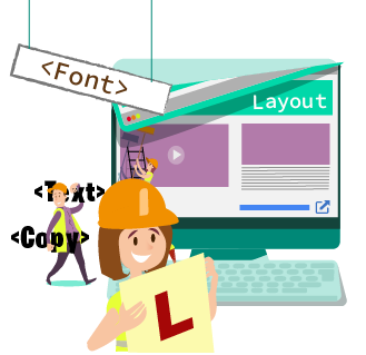
Week 2: Wireframes
A website wireframe is simply a design of what a website is going to look like before you build it. People use different pieces of software to do this, but I found that Adobe Illustrator works just fine for me.
The other piece of software I would recommend is Axure. Axure has better functionality and feels like it is actually built to do wire-framing, but Adobe can do a similar job and is part of the standard Adobe package which I use for my other projects.
I used my research to pull all of the different ideas I had into two versions. A mobile version and a desktop version. Some people also do a tablet version, but I didn’t feel this was necessary for this particular project.
The wire-framing stage is where the bulk of the user experience design comes in. Some basic principles to stick to when doing wireframes are as follows:
- Make everything simple – simplicity makes the flow much easier
- Build for scale – Build the site so extra things can be added without any problems
- Design in sections – that can be changed or replicated. – When you build in sections then designs are the same, which means that when you change something at a later point, it is easier to change everything in one go.
- Decide your colour scheme. The nicest websites have colour palettes that complement each other. This is a good place to start: https://coolors.co/
- Don’t do the logo first – You don’t know what will work until you have something for the logo to fit into.
- Always create wireframes
- Website images
Week 3: Website Structure, copywriting and imagery
Copywriting:
For me, copywriting is the bit I find the most difficult. I can write, but I do need help to make sure that my words come out correctly and actually make sense.
I outsource my website copywriting as it is a better use of time. If you are blessed with the ability to write perfectly then I am in awe. It goes without saying, if you find an area really difficult, then don’t be afraid to go elsewhere to get it done. After all, you are being paid to do a good job, it doesn’t matter how you do that job done.
It is, however, important to have a document outlining what you would like to go where. In this document you can have the URL links, names of the sections, copy required and what websites have similar articles to use as a reference. This means you can frame the amount of copy that is needed to be written and give lots of information to the copywriter or yourself when writing.
Website structure
The website structure is key to user experience, as it shapes how a user will flow through the website. I try to place everything into boxes that make sense. Once finished I send this to the client as a PowerPoint document to make sure I have everything right. There will be a few discussions before you finish with a completed document that should make sense.
A key point to add here, do not build a structure based on what the business thinks it is. So many times I have been involved with projects where it has been built from the inside out, rather than outside in. in my experience, websites become a user experience nightmare when they are built without the customer at heart. It is much easier to nip this point in the bud earlier, rather than let it become a bigger problem in years to come. Having to restructure an entire website is a hard and laborious job.
Imagery
Remember, images and buttons need to represent what you are and often what you want the customer to do. Images provide key user experience points as it can help to indicate what does what. Images give clarity to words. Having images that do not correspond to the subject area is confusing, keep the user in mind when you purchase or create images. Make sure your images are also in the same tone. Having different styles of images or imagery that doesn’t match your text makes it harder for your website to deliver a great customer experience.
Week 4: Build Websites
When writing your website, keep the user in mind. The website should match the wireframes from the previous weeks, but with a few changes here and there. If you feel a change could be made to make the user experience better, then do it. I found that changing the colour of buttons on hover made the flow much better and meant that the customer knew that it was clickable. You don’t need to make a website all singing and dancing at this stage, the basics done well will suffice.
The client meeting
Prepare for changes as there will always be some changes. Rather than go on about user experience to the client. I tend to talk about simplicity and ease of use for future customers. I find this is an easier message and gets straight to the point.
I usually find that it helps to explain your thinking and why you designed certain parts in a particular way. Having this discussion gets you both to think about the perfect solution with user experience taking centre stage.
Then make the final changes and you are done! Here is my effort: Landlordcertificatesdirect.com
And you're done
A bit like painting a wall, the preparation is the bit that takes time, not the actual painting itself. It is the same when it comes to websites. If you want a great user experience, then you need to be thinking about it from the beginning and including user experience at each corresponding stage.
Of course, you may look at my efforts and decide that I could have done this or improved that. Websites can always be improved and I am not yet a hard-core developer so I hope you will forgive me for any point that could be improved. But, I do hope you can see that within my effort, I have tried to put the user at the forefront of my designs. You don’t have to be a seasoned coder or marketer to try and think in this way, you just need to constantly be thinking about the subject. Great user experience is a marathon, but you need to start somewhere. Learning to walk is just as important as being able to run.