The future of search is mobile-friendly.
Our mobiles are ingrained into every part of our lives. They connect us with our friends and family; they wake us up in the mornings; and they’re the first thing we turn to when trying to find the answer to a query.
As a business, it’s never been more important to ensure your website is up-to-scratch for the visitors accessing it through their mobiles.
If it’s not, they’ll get frustrated and leave.

There’s so many other webpages out there that offer the same information as you. And so you need to ensure it’s mobile-friendly in order to keep your users engaged and satisfied.
What do we mean by ‘mobile-friendly?’
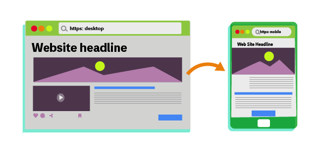
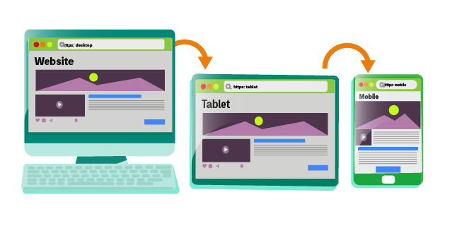
A mobile-friendly website is one which doesn’t just look and work smoothly on a desktop, but on smartphones, tablets and other small devices.
A website that’s optimised for mobile will automatically resize to display on these types of devices. They also ensure all normal user journeys are completed without any complications.
For example, a visitor should have the same smooth journey when subscribing to a newsletter or purchasing a product on their mobile as they would if they were doing these actions on a desktop computer.
Why make your website mobile-friendly?
It’s important to focus on user experience (UX) to make browsing your website as enjoyable as possible.
As more consumers reach for their smartphones to make purchases or access information, prioritising a mobile friendly experience is essential.
But there are a few other reasons why you should consider making your website mobile-friendly:
1. Google prioritises mobile-friendly websites
In recent years, Google updated their algorithm to include a mobile-first index. This allows it to better connect and display for users on mobile devices with optimised websites.
2. Smartphones are a huge part of search
Today around 60% of search queries come from mobile devices. Why? Because it’s quick and convenient. So make sure your website is able to satisfy those users accessing it this way. And ensure you website content is optimised for mobile devices.
3. Forge connections with your target audience
If your site is optimised, then anyone using a mobile device will have a positive user experience. Thus, they will be likely to visit your other pages and return in the future.
4. Keeps your brand relevant
As mobile-friendly sites become the new norm, any business website that isn’t mobile optimised will look outdated.
Even if your content is brand new, the poor design will make you stick out like a sore thumb and no one will want to engage with that.
5. Rank for local searches
If your business has a physical presence, then optimising your site for mobile will help you to rank for local SEO searches.
Connecting you to the people in your local area that want your service. It’s an easy win in terms of gaining more site traffic.
6. Speak to different customers at all times
By optimising for mobile, you are catering for more customer types. For instance, the person searching whilst chilling in the evening on their phone and the person sat at work in an office in the morning.
How do I know if my website is mobile-friendly?
You can easily check whether your site is mobile-friendly by visiting it from a smartphone.

Ask yourself the following questions; is simple to use and navigate? Does the page properly fit your screen? Are all the menus visible, and when you tap on them do they open seamlessly and display properly?
If a site is hard to navigate, slow on your mobile device or you have to zoom in and out to use it, you haven’t optimised it for mobile.
If you use a content management system such as WordPress then it is likely you are using an optimised theme, but it is worth checking just to be sure.
Ways to Optimise your Website for Mobile
Optimising your website for mobile is relatively easy to do, and there are 9 actions you can take today.
1. Enable Google Accelerated Mobile Pages (AMP) markup

In 2016, Google took the initiative to further improve the user experience on mobile devices. And so, they integrated AMP into its own mobile search results – a specific markup in HTML code. This focuses on improving the design and increasing loading times for web pages on mobile devices.
As a business, you will gain significant benefits in your SEO if you implement AMP markup on your website.
For one, search results with AMP are ranked highly, sometimes even above paid ads within search results.
And secondly, you can make use of the AMP to improve your content’s loading speeds and appearance. This ensures the experience for your site visitors as good as it can be.
Content carousels
Just one of the ways Google’s AMP markup can improve your content’s appearance is with the AMP content carousel. Users will be able to glance at even more content from your website compared to a simple search result.
Every time you publish an article to your blog, it will create a new entry on the carousel.This allows you to squeeze a ton of content into a single search result and boost your reach significantly.
There are also carousels designed to show feeds from your social media sites, such as Facebook, Twitter and Instagram. When deployed in tandem with AMP carousel, you will be able to pack even more content with two or more scrolling search results.
Implementing AMP
AMP is designed to reduce mobile pages to its bare minimum, removing all the unnecessary bells and whistles to allow faster browsing on a limited speed mobile network.
With this push for AMP content, more websites developers are forced to build simpler web designs with shorter load times.
To start implementing AMP, you’ll need to integrate three components into your website’s structure.
i) AMP HTML – This is a form of redesigned HTML that uses custom AMP-related commands to allow for more dynamic mobile content.
ii) AMP JS – This is a form of Javascript that allows asynchronous loading, which is the goal of the AMP structure.
iii) AMP CDN – A content delivery network hosted by Google that handles cached content.
When you optimise your site for AMP, it’s like creating two websites at the same time – one for mobile devices, one for everything else.
Please note: This can mean a huge amount of extra development work, so be sure that this is going to be a game changer before you head down this route.
You’ll need to implement some different code on both of them, but the benefits they can bring for your site’s optimisation are endless.
2. Choose a responsive web design
By now, having a responsive web design is the gold standard for any modern website looking to maintain its rankings.
Having responsive HTML code allows your website to adapt accordingly to the various screen sizes and orientation of any device that is viewing the content, whether it’s from a laptop or a mobile phone.
It’s sleeker, cleaner, and more powerful
By making simple HTML tweaks, you can ensure that every image and text on your website is displayed exactly how you want it to be.
You can dictate how your website looks on desktop versus a mobile device too. For instance, you might want a landscape orientation on the desktop and a portrait orientation on smartphones.
Responsive coding lets you personalise each device user’s experience while also cutting down on the required HTML code.
This all may sound rather technical, however choosing a responsive web design is relatively easy to do. Most website management systems, such as WordPress will allow you to install a responsive theme. Simply download the one you want, and you’re all set.
3. Compress images

Images are essential for almost any content you place on your website.
They help to make large chunks of text easy to read and scan, giving your readers context and increased accessibility.
Images are also highly shareable on social media, such as infographics.
Visual content should be one of your primary concerns
When you have lots of images on your website, you will soon discover that they occupy a lot of space and bandwidth on your web server.
And when that happens, your website will load more slowly. This will affect the experience for your mobile users who are on slower cell networks.
To solve this, compress all your images before you upload them to maximise server space and improve load times.
When you compress your images, you need to determine which file format is the best for your website needs. Some of the most common image file formats you can use are JPG, PNG, and GIF.
PNG is usually the most recommended file format for images. Thanks to its ability to reduce file sizes by up to 95% in Photoshop with barely any loss in quality.
4. Remove Flash

In the early years of the Internet, Macromedia (now Adobe) Flash was all the rage.
Everything on the web was powered by Flash – website headers, landing pages, chat boxes, online web games- you name it. They depended heavily on complicated code which proved to be too clunky for its own good.
And little by little, major websites start to drop Flash in favour of simple, sleek web design. Today, HTML5 is the new standard due to its lightweight code and ease of use.
Unlike HTML5, Flash doesn’t translate well to mobile at all. And to make things worse, there are several security vulnerabilities in Flash, making it unsafe for any user.
While Flash is excellent for games, it certainly isn’t mobile-friendly and has no place on any business website. If your site is still running Flash, it’s time to re-evaluate and move forward with the times.
5. Clean up your mobile site’s structure
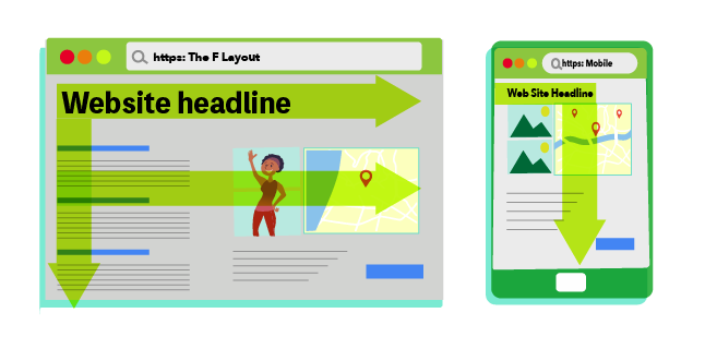
The way searchers browse websites on mobiles is completely different to the way they search on desktops. Therefore, you need to structure your website in a way that satisfies these users, ensuring your site is mobile-friendly.
On desktops, users tend to scan websites in an F-shape pattern, starting from the logo and then across to the right, followed by a quick downward scan towards the bottom of the page.
But on mobile devices, users tend to hone in on the area that is relevant to their search, then read the content downwards.
It’s very much unlike the typical F pattern that users do when they read desktop pages.
You need to visit your mobile website and see it with your own eyes, then you’ll be able to understand it from your audience’s perspective.
Once you put yourself in their shoes, you’ll be able to tweak your page structure to improve the experience of mobile.
6. Take advantage of free Google tools

Currently, Google takes up a market share of 91.75% of all internet searches.
Therefore, you want to make sure your website is indexed on Google, and that you’re making use of all the free tools that they have to offer which have integration with mobile user metrics.
Most keyword research tools allow you to change the device type in order to gauge how popular different keywords are for mobile users.
For example, Google Search Console has a section where you can test how mobile-friendly your website is. It’s a great start in figuring out what you need to do in order to best optimise your site.
In addition, Google Analytics now also includes more detailed mobile usage metrics that you can access. By clicking ‘Mobile,’ then ‘Devices,’ you can glance at more detailed information. You will see which specific mobile devices are accessing your website to what your customer behaviour is.
By using these tools to get insights in your customer’s behaviour on mobile, you can take the necessary steps to better improve their experience and keep them returning.
7. Improve loading speeds

Loading speeds on desktops are imperative to your user experience. Slow page load times can cause high bounce rates and can affect your ability to rank highly.
The same goes for mobile devices.
This means if you want to rank highly for search queries on mobile, you’ll need a fast website that even users on slow cell networks can use.
There are many ways to achieve improved speed, such as compressing your images, cutting down on the number of redirects a page has, and optimising your website’s code.
They may take a bit of time to action, but once you’ve worked through them you’ll be saving a lot of headaches for your site visitors.
8. Make full use of title tags
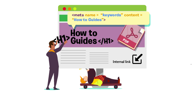
Searches on mobile tend to have different semantics than searches on the desktop.
And for this reason, Google has increased the title tag character limits to 78 (versus 70 on the desktop). This means as a marketer, you will have more opportunities to draw in searchers.
Commonly referred to as the meta title, the title tag is the short text blurb that Google users see when they are browsing through search results on Google.
When users on desktops see a piece of text that is too long, Google cuts it off. But the same text will be fully visible on mobile devices because of the longer character limit.
The higher limit gives you more virtual real estate to play around with.It allows you to insert more keywords, especially long-tailed keywords, to help you reach more potential users.
9. Remove pop-ups on mobile
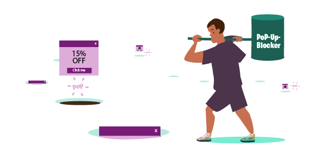
Pop-ups have always been frowned upon by Google, as they are disruptive to a visitor’s experience. Especially on mobile. And therefore if your mobile website has them, you could be penalised.
Smartphones have limited screen real estate to play with, so a fullscreen pop-up will disrupt the browsing experience.
Instead of using pop-ups to encourage sign-ups or publicise any promotions, consider replacing them with other forms of digital advertising.
For example, you can make use of in-text hyperlinks with affiliate referrals to earn ad revenue. Or, you can insert call to action (CTA) prompts and buttons across your web pages to encourage conversions.
These alternatives help you earn ad revenue without the fear of being penalised by Google.
Pop-ups aren’t effective anymore
While you can still run pop-ups on a desktop website, they are no longer as effective as they used to be. This is thanks to the widespread use of pop-up blockers.
So, as good measure, you should just remove pop-ups from your website altogether.
Summary
There’s no doubt that when it comes to search, the future is mobile. And we should all be preparing for it.
Making your website mobile-friendly is a brilliant way to enhance the user experience for your visitors. It will also ensure you’re ranking highly to draw in even more site traffic.
The key is to reduce friction in the mobile browsing experience, eliminating the number of frustrated users.
If your audience can perform most user journeys, such as reading your blog, purchasing your products or subscribing to your newsletter, then you’re more likely to have a loyal customer base who return again and again to engage with your brand.
You’re also much less likely to have a high bounce rate on your site pages.

Start making changes today
There are plenty of small and easy changes you can make to your website that will optimise it for mobile. Particularly if you already use a content management system, such as WordPress which has lots of auto-optimisation features for mobile.
Finally, don’t forget to make use of the free tools available to you on Google. They’ll offer valuable metrics that show how visitors are operating your website on mobile. They’ll also offer insights on how to improve the user experience, so you can begin making your site more mobile-friendly.
Reaching Out to a Marketing Consultant
Optimising your website to be mobile-friendly is just one of the ways you can increase your chances of ranking highly. It can also increase the number of unique searchers who land on your website.
Forming an overall marketing strategy for your business involves a lot of research and planning. This is something which can take a lot of time to produce.
Therefore, recruiting the help of a marketing consultant such as myself may be a great option. Especially if you’re constricted on the amount of time you can dedicate to it.
My team and I will create a bespoke marketing strategy that works with you and your business needs directly. One designed to optimise your website, be mobile-friendly and increase your rankings and your site traffic.
Get in contact today to hear about some of the ways we’ve helped companies in the past. We’d be happy to have an obligation-free chat about your brand and what your website performance could look like.
